20 Years of Care: The Hayat Group Anniversary Identity
Project:
Creation of the event identity to celebrate 20 years of excellence at Hayat GROUP.
Objective:
Design a minimalistic and festive visual identity that commemorates two decades of innovation and commitment, while unifying all Hayat products under one strong concept.
Initial Brief:
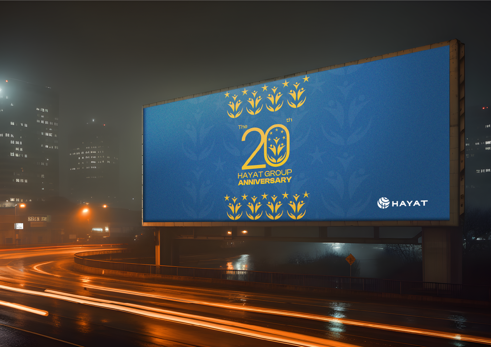
The brief called for the creation of an anniversary logo to be applied across all visual materials and products, thereby enhancing the visibility of this milestone event at every customer touchpoint.
The Process:
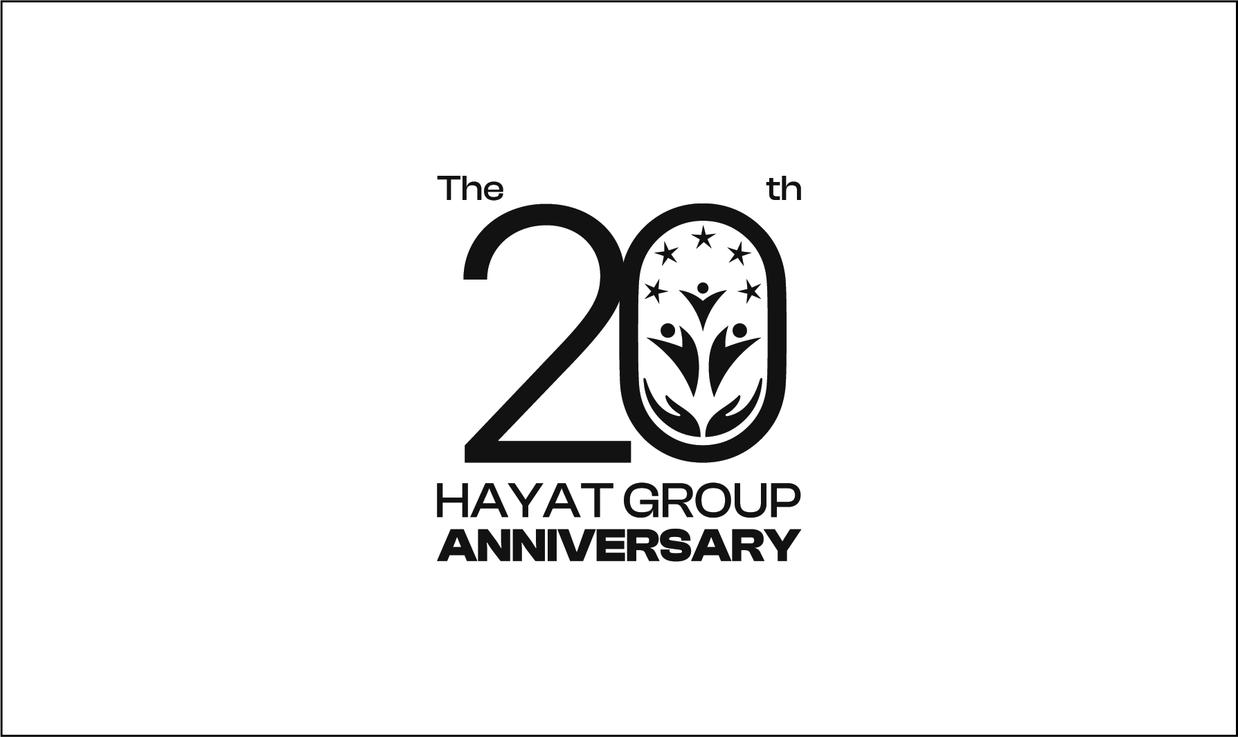
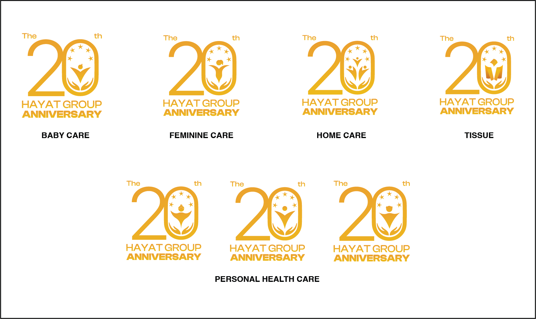
By delving into the history and identity of the group, a compelling idea emerged: develop a concept that brings together all of Hayat’s products. This creative journey led to the design of a unified logo built around a fixed “20” and a variable “0” that adapts to each product category.
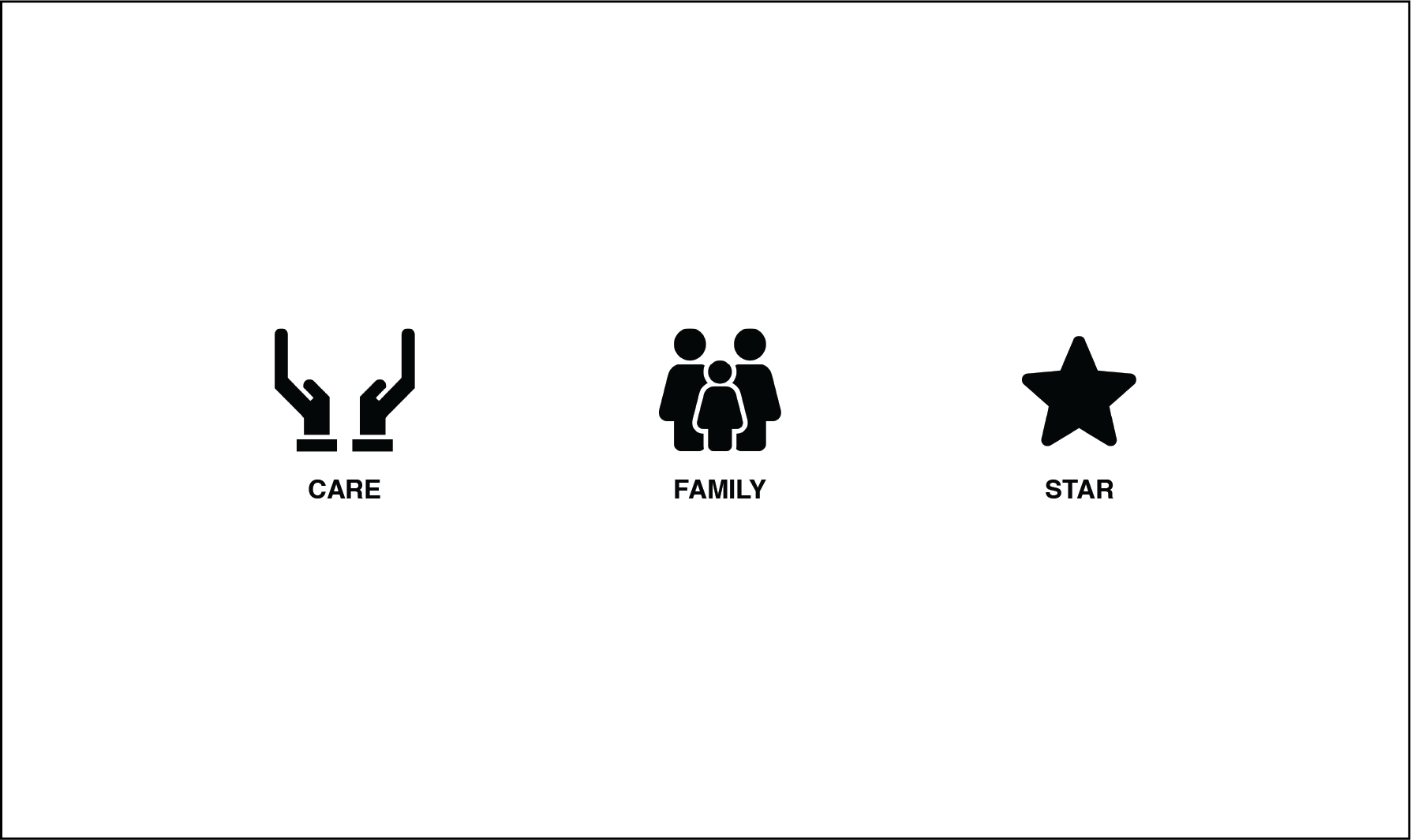
To enrich this concept, I merged two key elements that define Hayat’s DNA:
- Care, representing the unwavering commitment to quality, and
- Family, as all products are designed with households in mind and aim to promote collective well-being.
To further emphasize the celebratory aspect and to visually represent the five product categories, I integrated five stars into the logo. Each variation of the “0” incorporates a graphic element tailored to its specific segment:
- For baby care, a motif evoking tenderness and protection,
- For feminine care, a delicate and harmonious form symbolizing grace,
- For personal health care, a dynamic icon representing energy and well-being,
- For home care, a symbol illustrating comfort and conviviality, and
- For tissue paper, a stylized representation evoking softness and practicality.
Without a preliminary sketching phase, I directly worked in Adobe Illustrator to trace the logo and develop its five variations. Adobe Photoshop was then used to bring the event identity to life through various mockups across different materials.
Implementation and Testing:
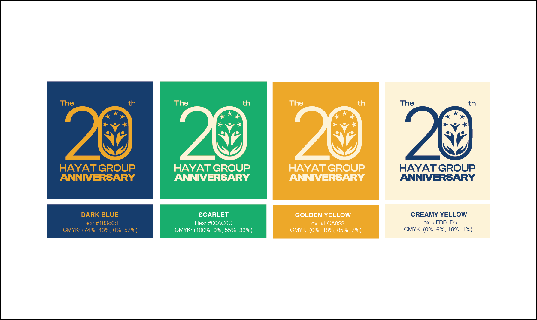
After defining a typography and color palette that resonated with the spirit of the project, I created several mockups to test the logo and its variations on packaging and communication materials. This testing phase confirmed the visual identity’s effectiveness and coherence across all contexts.
Outcome:
The final visual identity not only celebrates Hayat GROUP’s 20 years of excellence but also unifies its diverse product segments under one unique concept. The fusion of the ideas of care and family, combined with the symbolic integration of five stars and the clever use of a fixed “20” alongside a variable “0” enriched with category-specific graphic elements, has resulted in an elegant, festive, and instantly recognizable design solution.
MEET HAYAT 20 YEARS